BRANDING
•
ART DIRECTION AND EXECUTION
•
BRANDING • ART DIRECTION AND EXECUTION •
Call Your Mum
-
Goan Dogs are a UK based band that were releasing their debut album. My job was to take their album title - Call Your Mum - and build an entire visual world around it.
I served as Art Director, Lead Creative, Designer and Animator on this one, working closely with the client to deliver a campaign that supported their music as accurately as possible. -
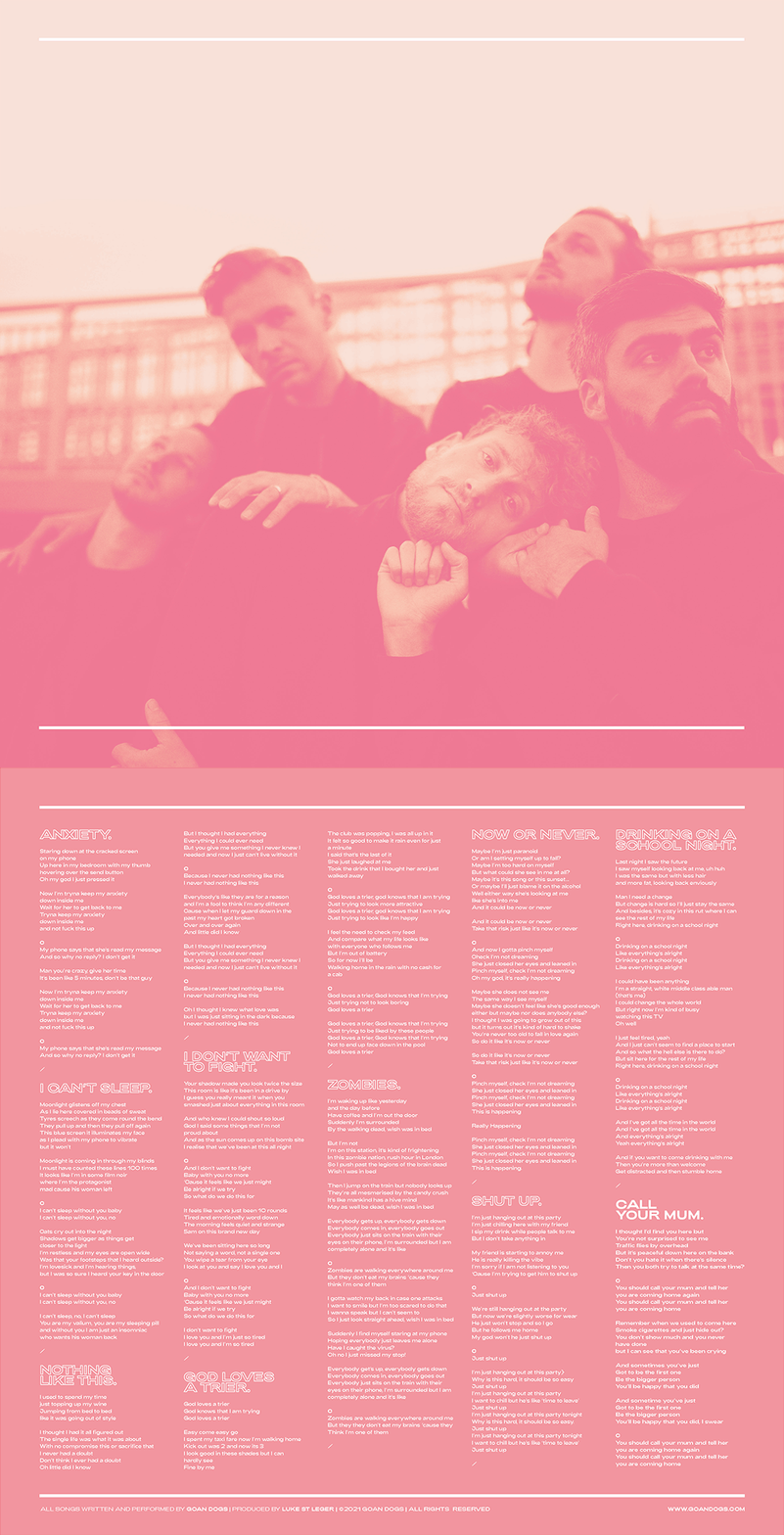
Call Your Mum is an album about living life. And not to the max, it’s about every day experiences and everyday problems. My job was to create a striking and powerful visual identity that spoke to this mundanity with beauty and subtlety.
Beginning with a photo shoot and a lot of 90’s landline telephones, I worked to create a nostalgic yet modern visual identity to accompany this album through it’s release journey.
-
Updated brand visuals
Album visual identity
Social content (static and motion)
Print (including vinyl, posters and merch)
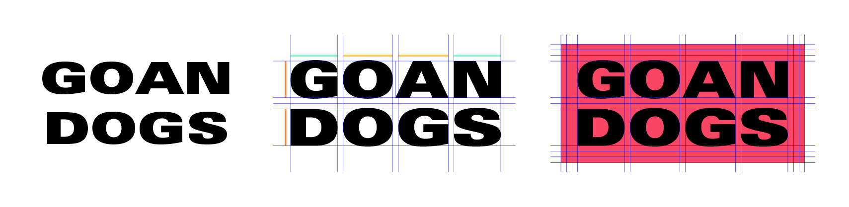
Logo update
Album front cover
Process and final result
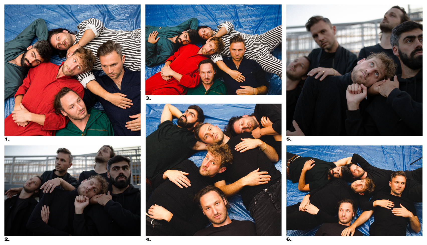
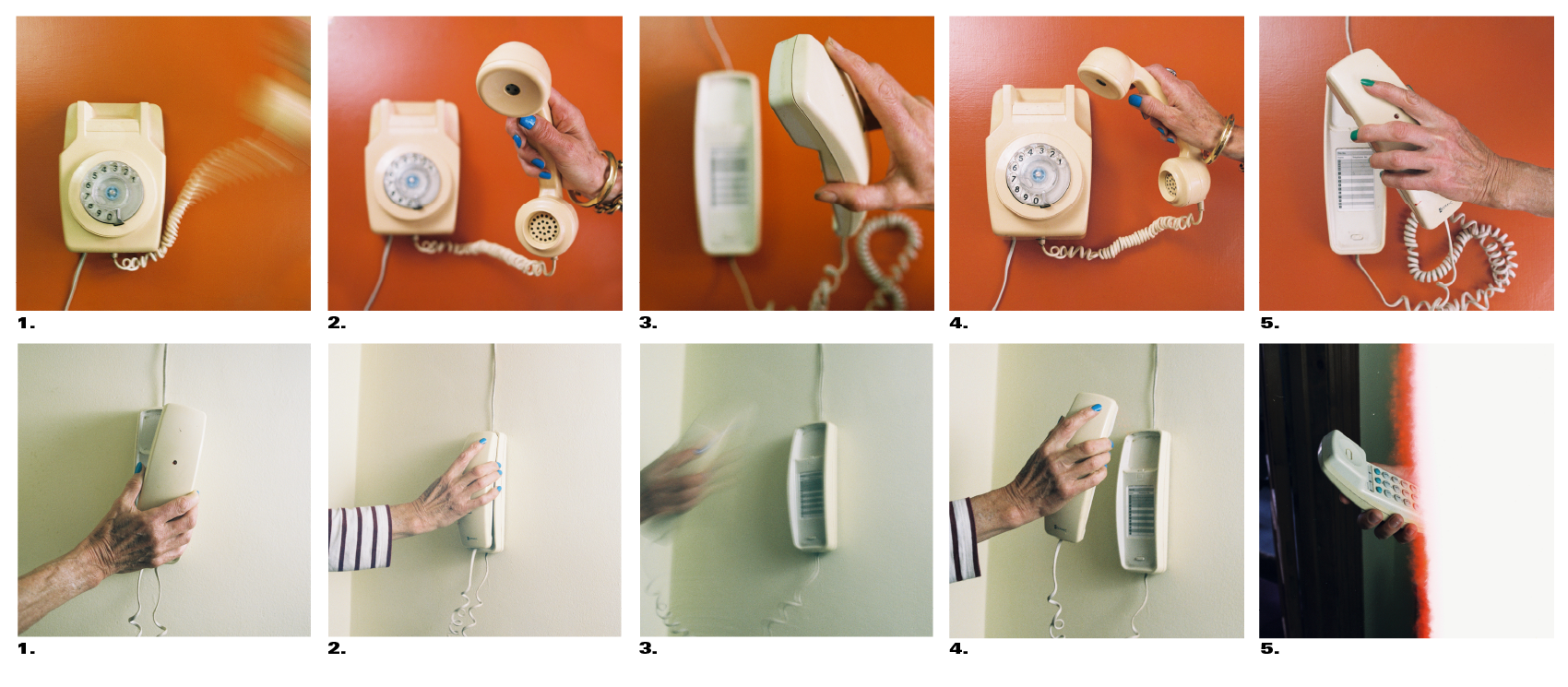
This is a contact sheet from the photoshoot for the album cover. The selection of this image was pivotal - it would turn out to be the driving visual for most of the marketing for the album. I knew that I wanted to hint towards an almost childhood nostalgia (calling your mum in itself feels somewhat teenage) and we had two phone options that evoked this feeling.
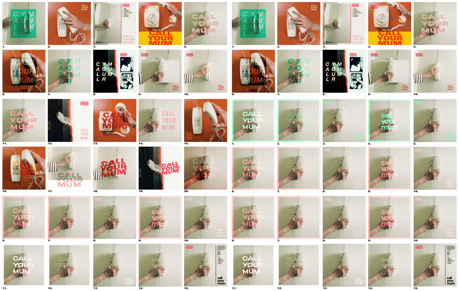
Above is an insight into the sprint style development of the album cover. Initial concepts explored different photographic and graphic elements, before I focussed in on a specific photo and made choices on typographic layout and treatments. It was important to combine a 70’s album design aesthetic with more up-to-date colour and typography choices.
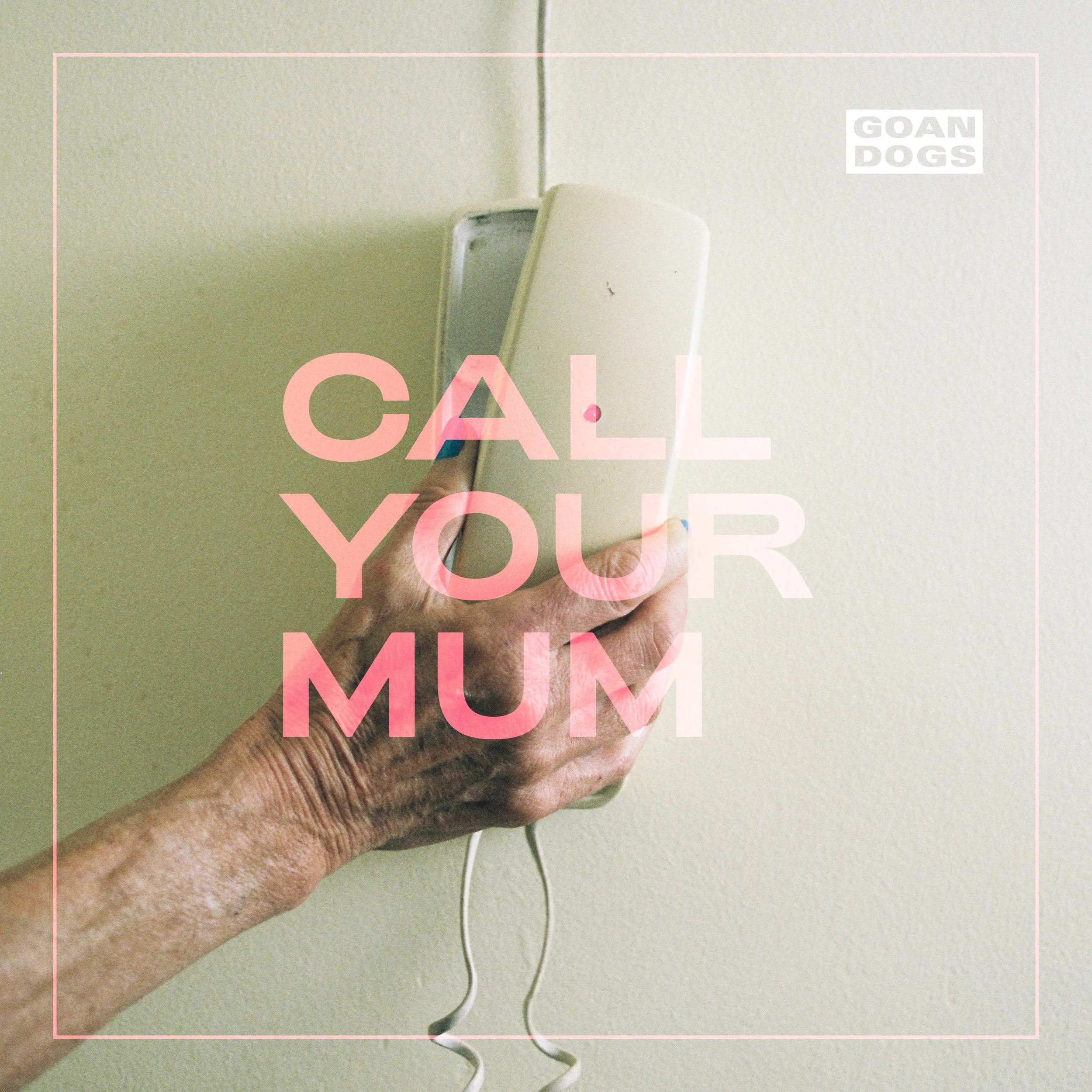
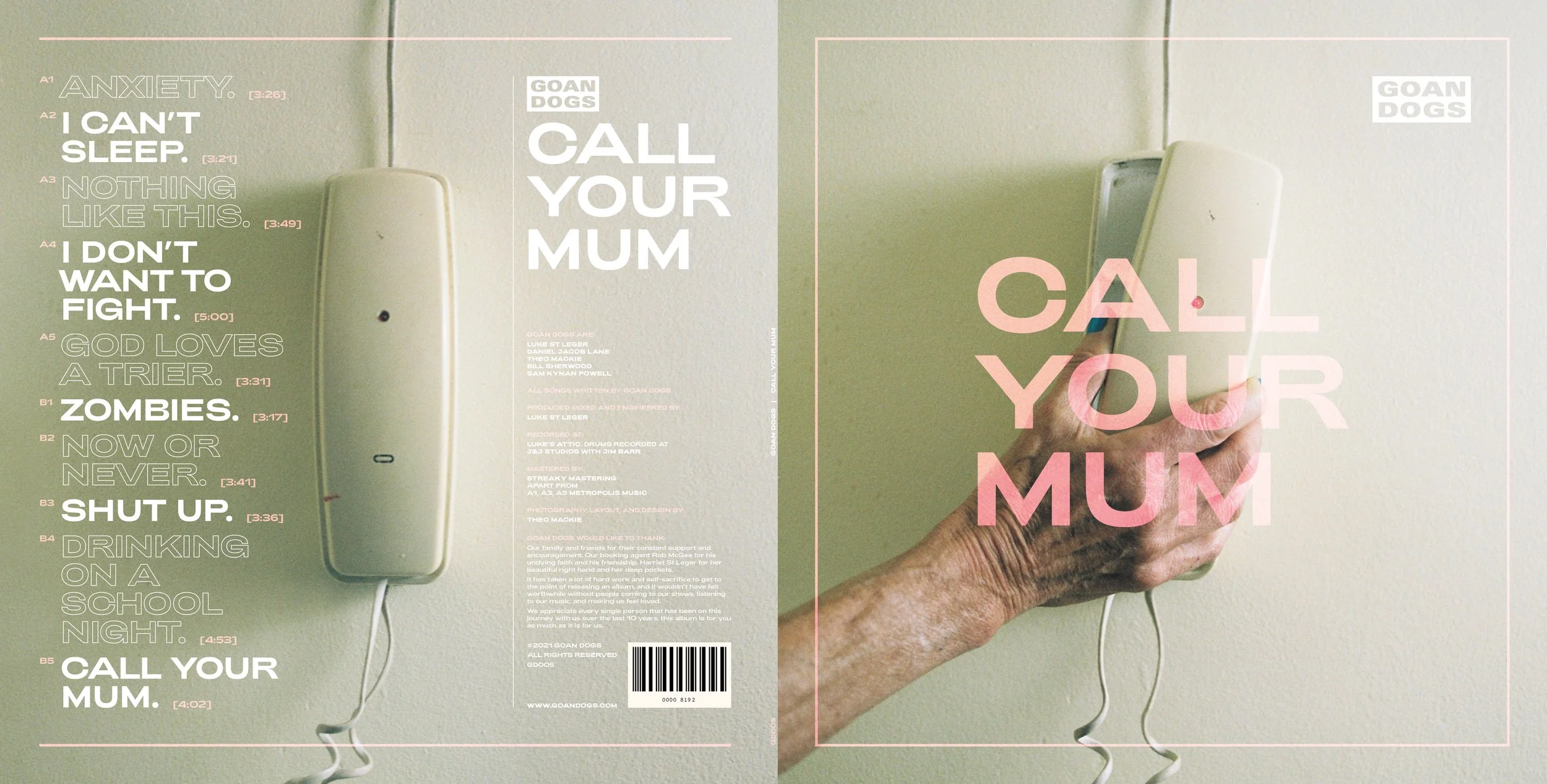
Final album cover
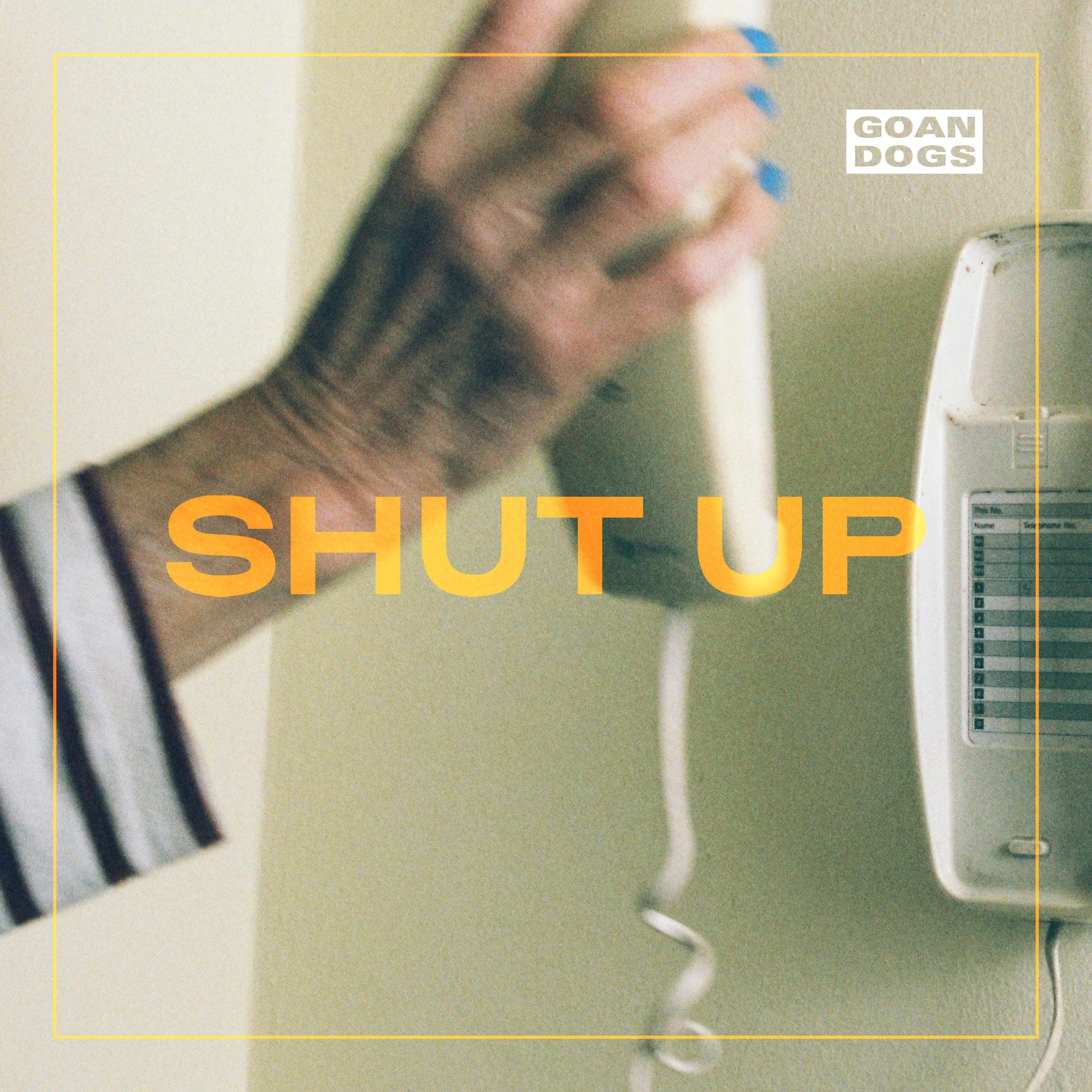
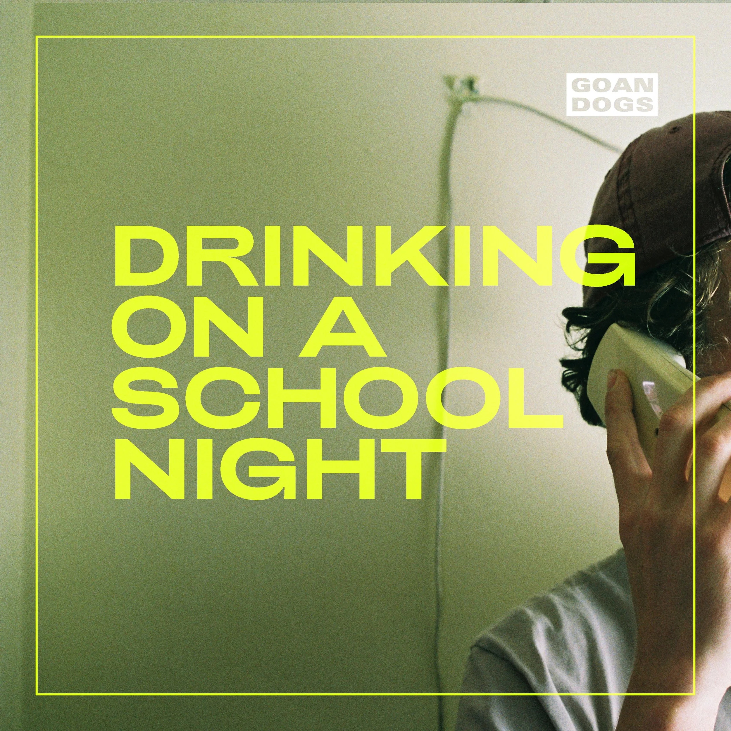
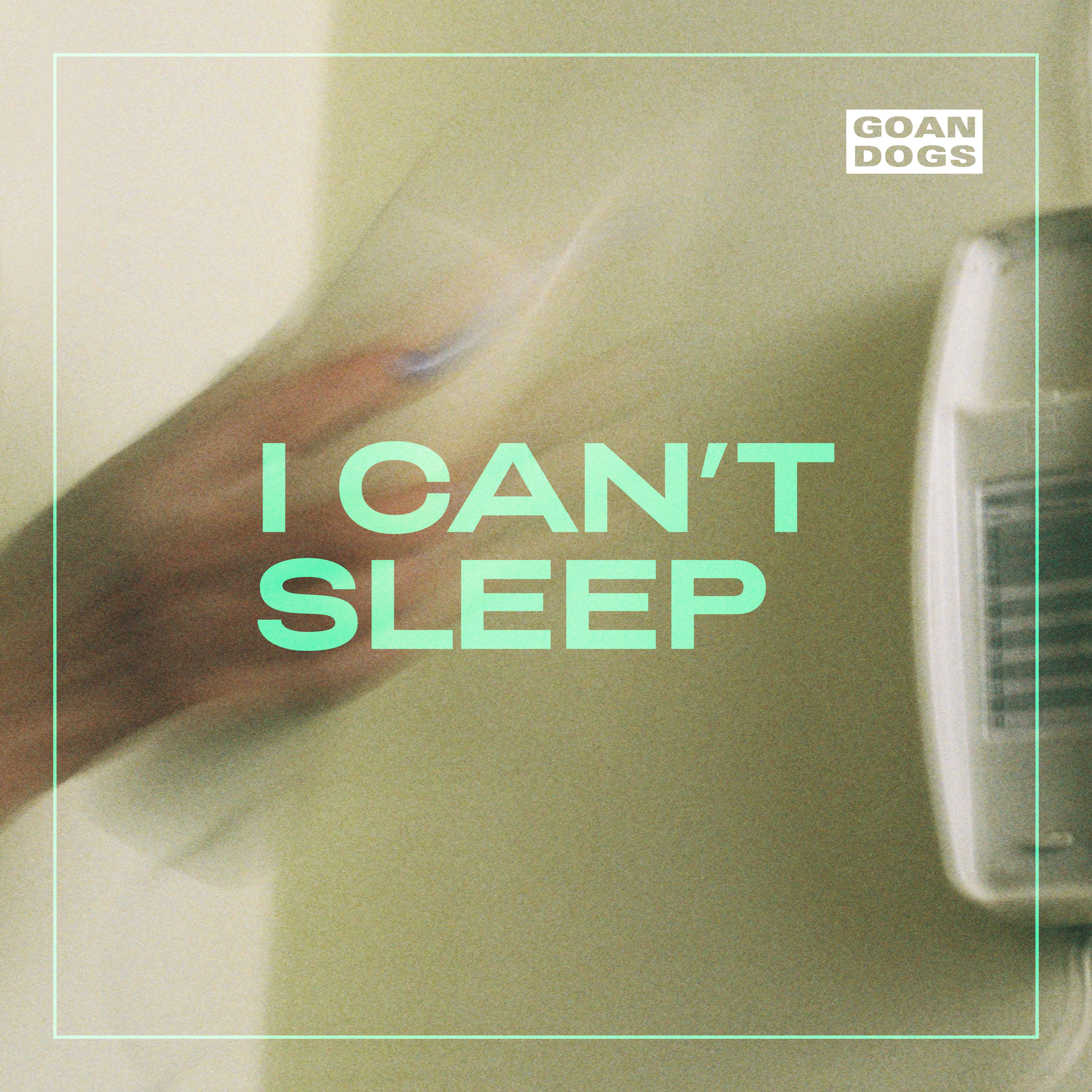
Single covers
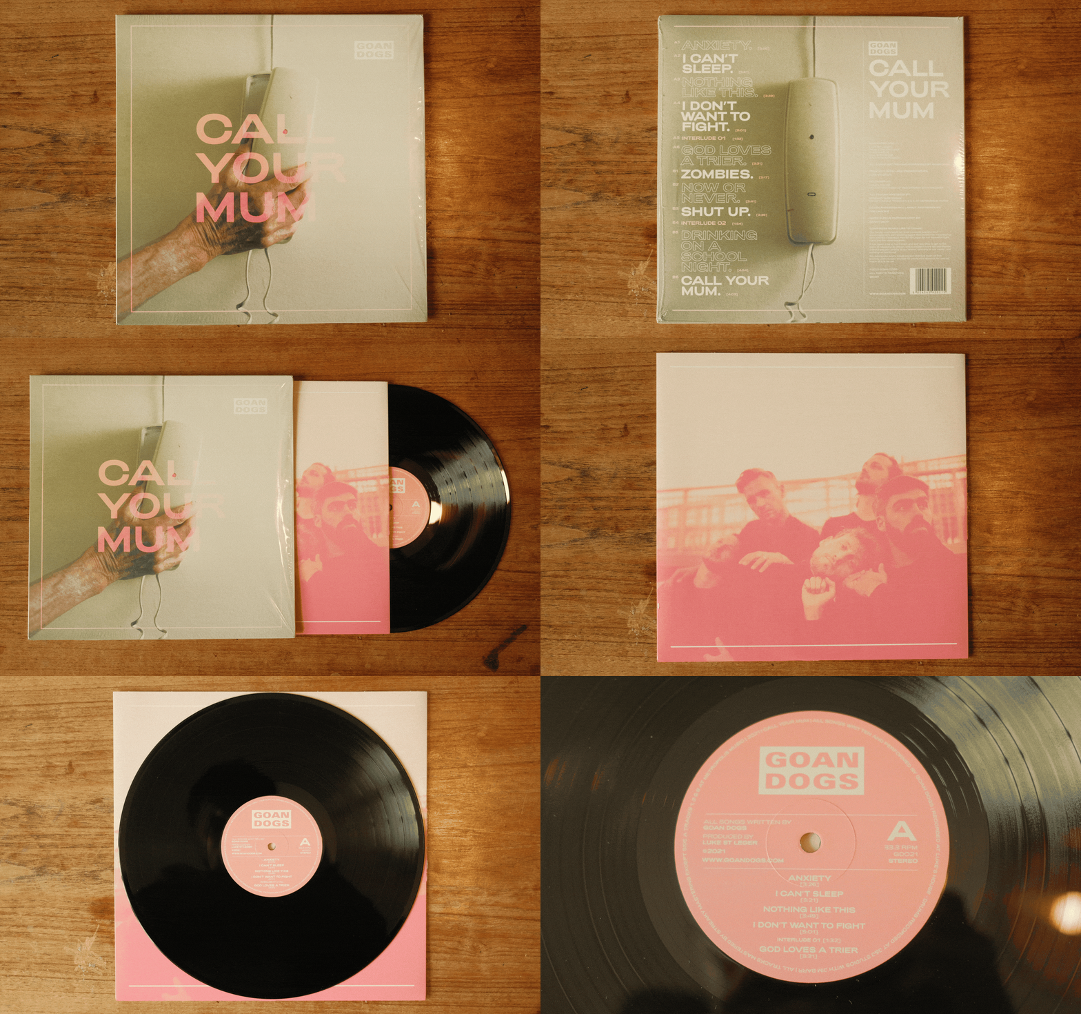
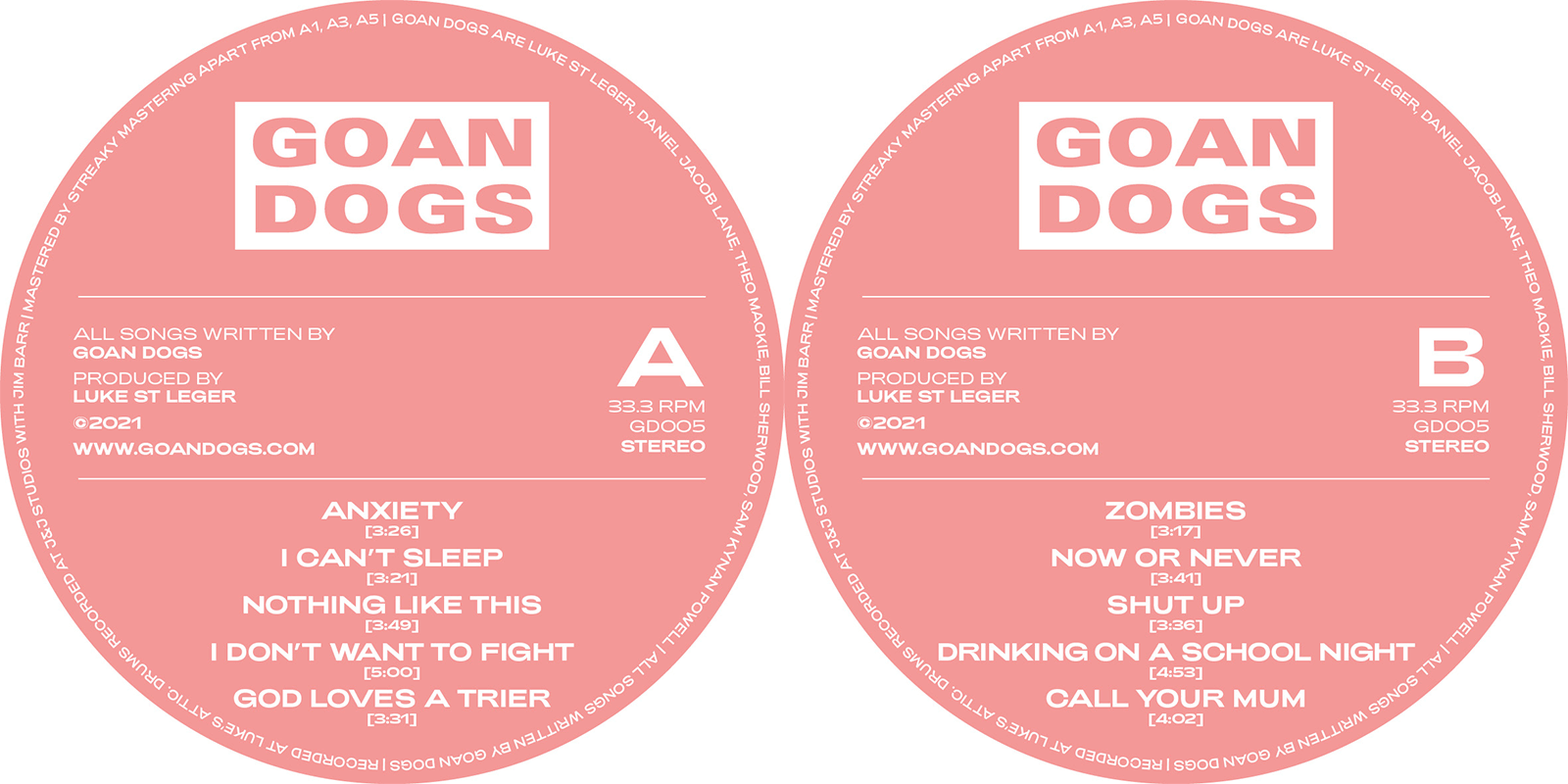
Vinyl packaging design and execution
Social & Marketing Content
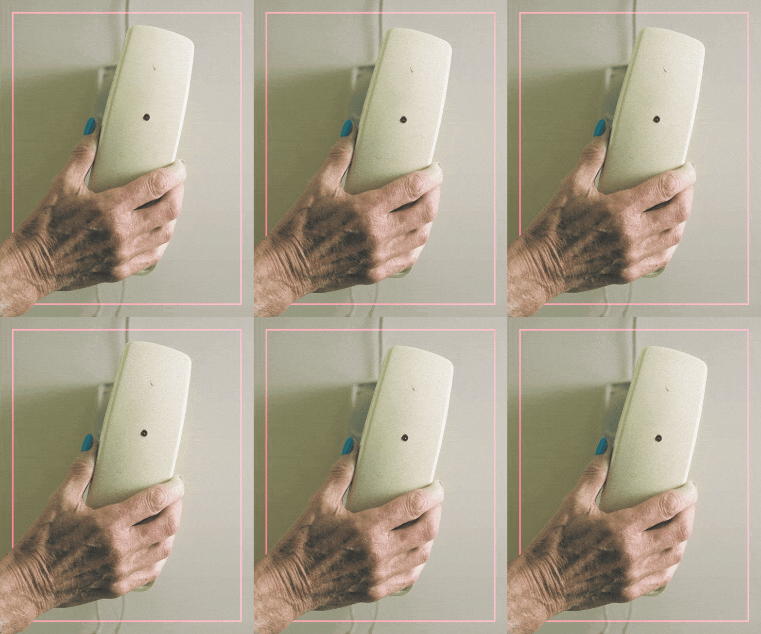
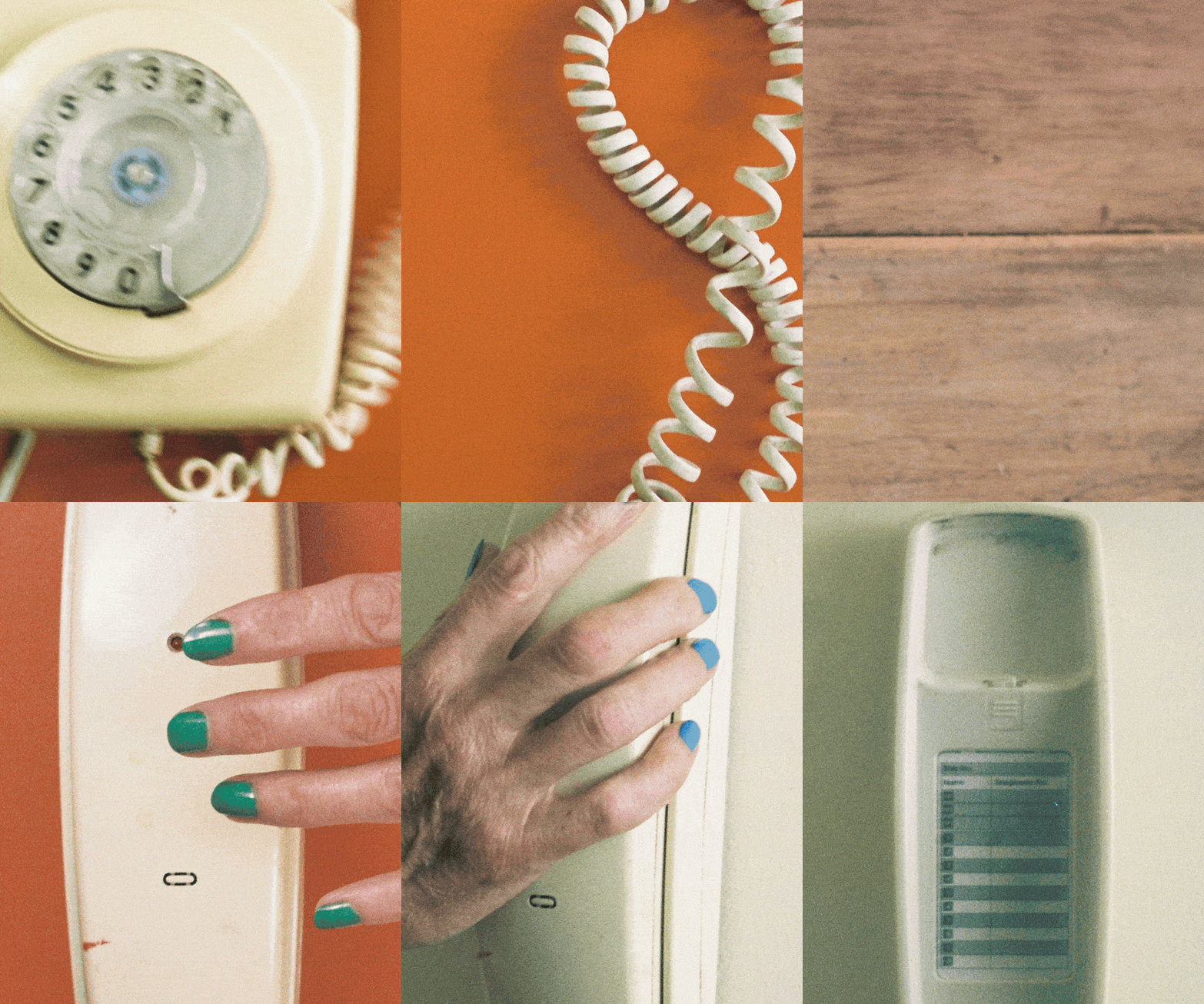

I made a selection of animated textures, with visuals taken from the B-roll of the album cover photo shoot. I also created to graphic and motion elements elaborating on the reoccurring line work. These assets then became the backbone of animated social assets.
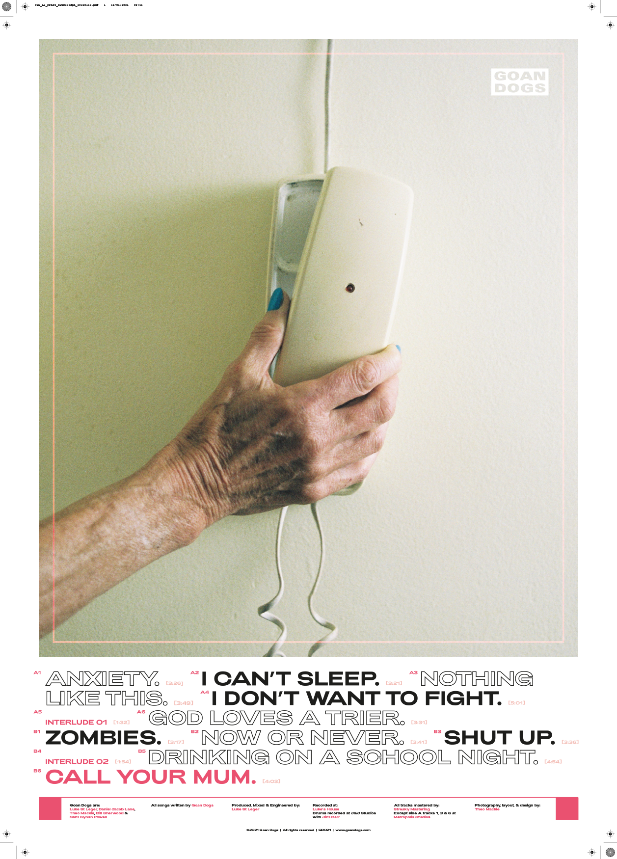
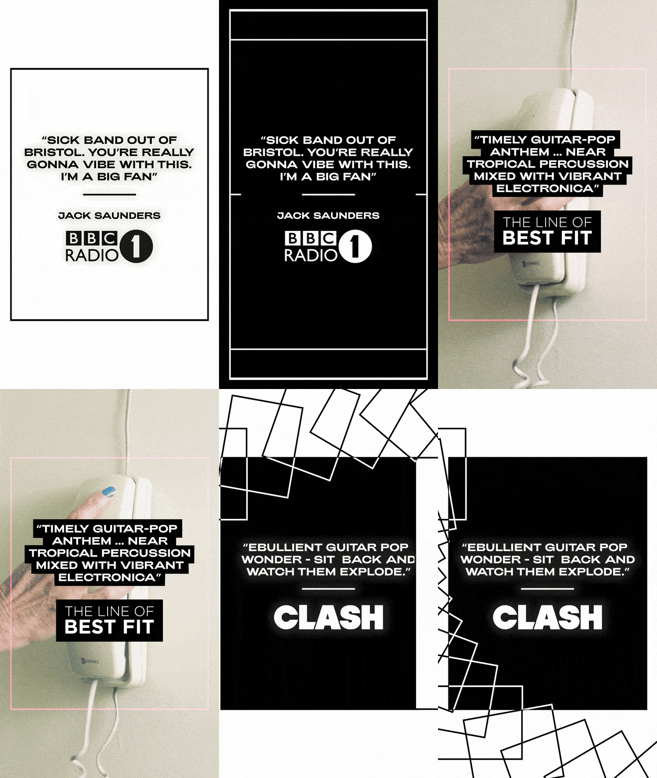
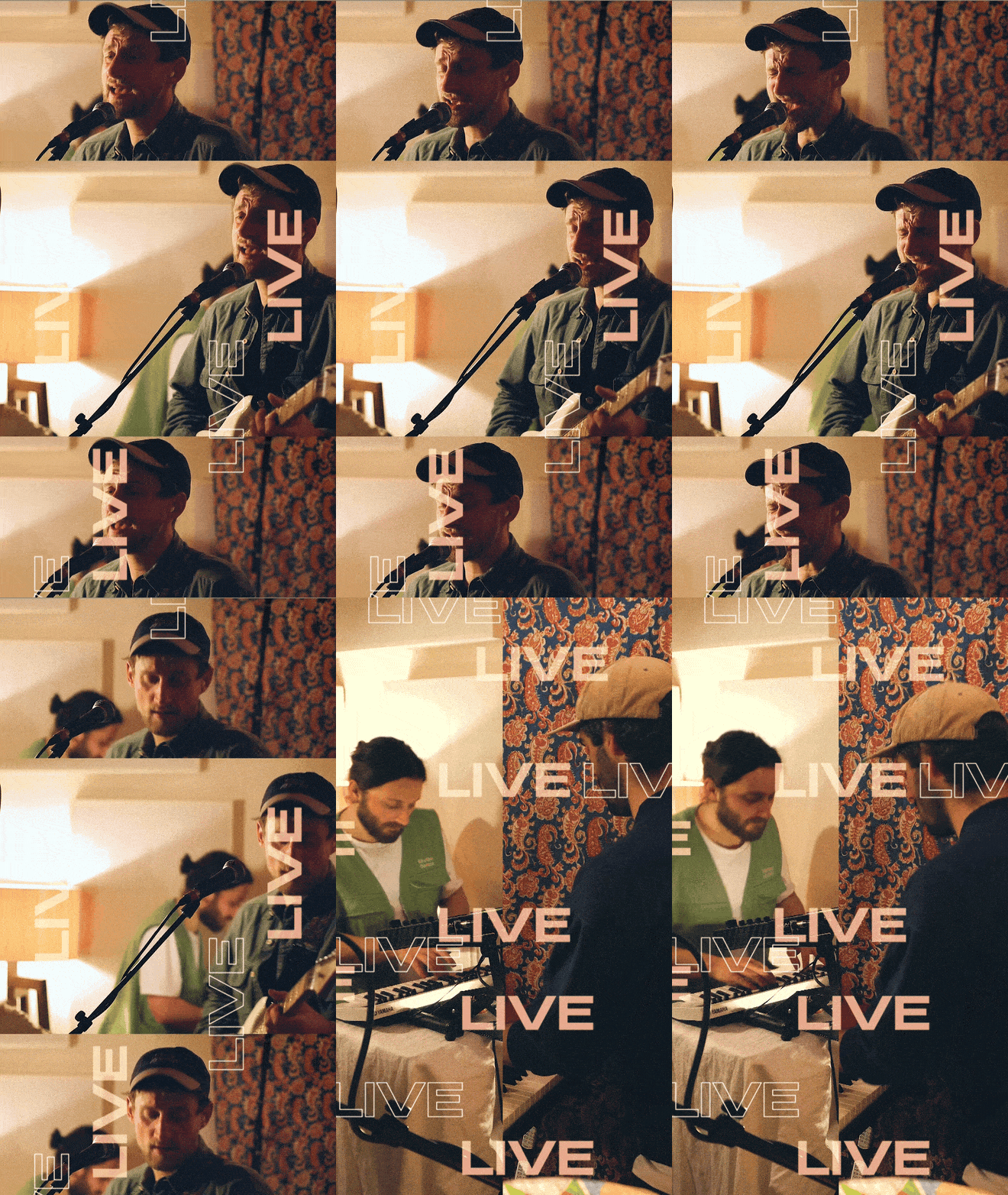
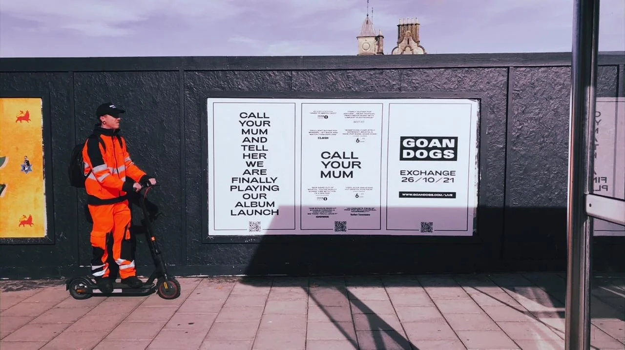
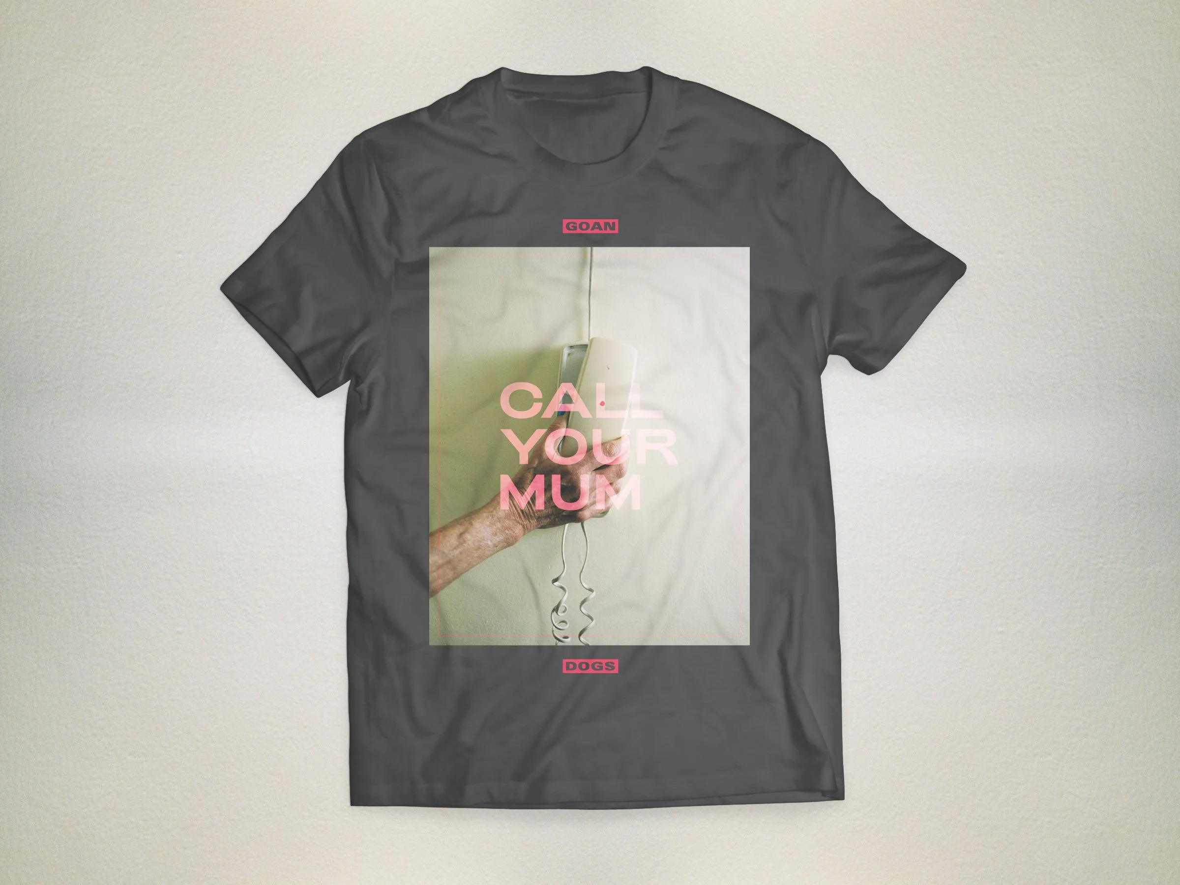
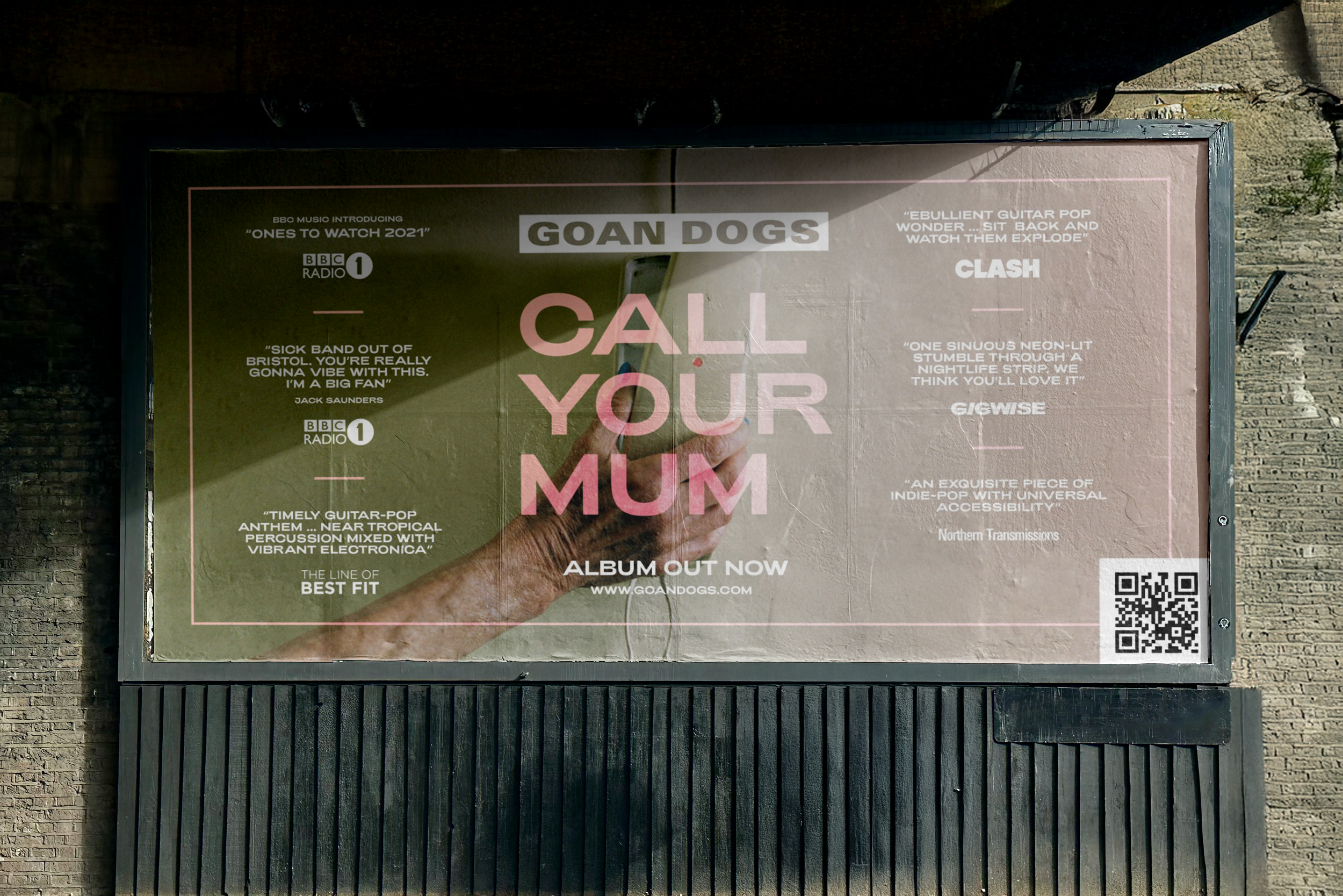

This is just a selection of the marketing assets that were created to support the albums launch. I created social assets, print advertising, as well as merchandise for the band to sell.
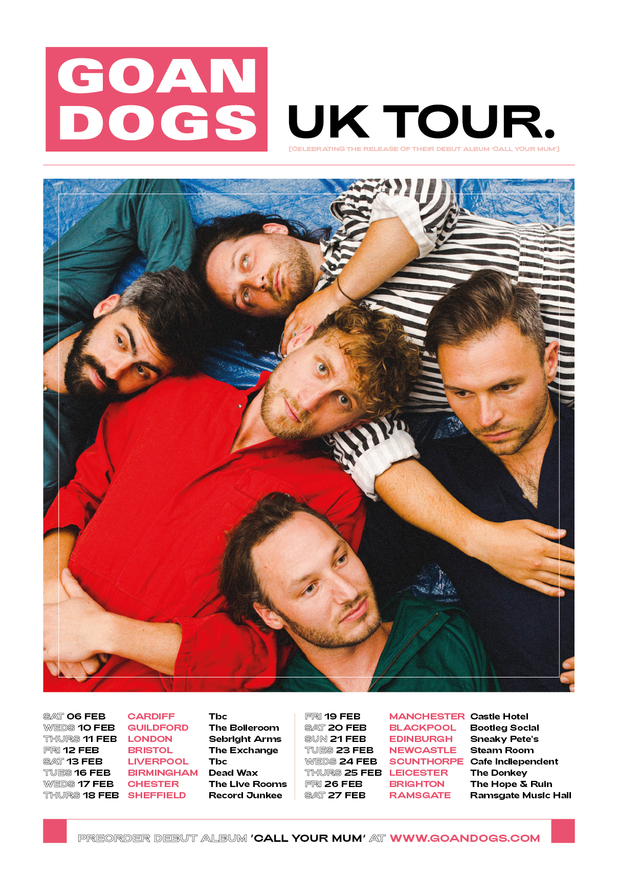
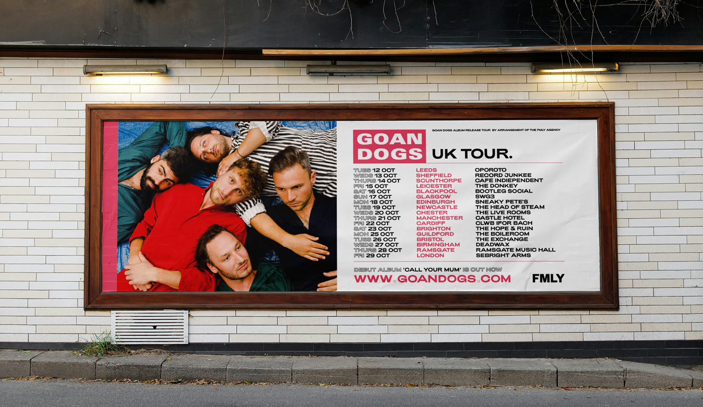
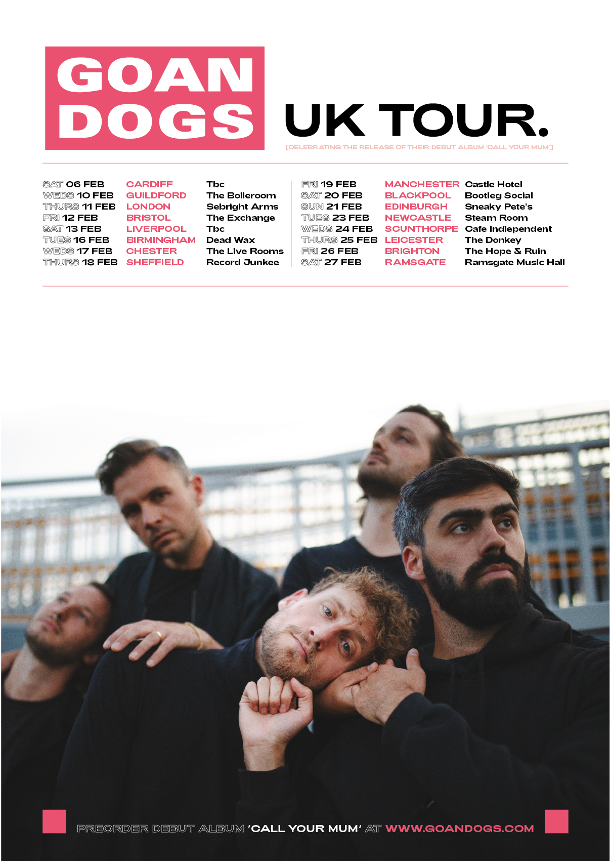
Album Tour Visuals
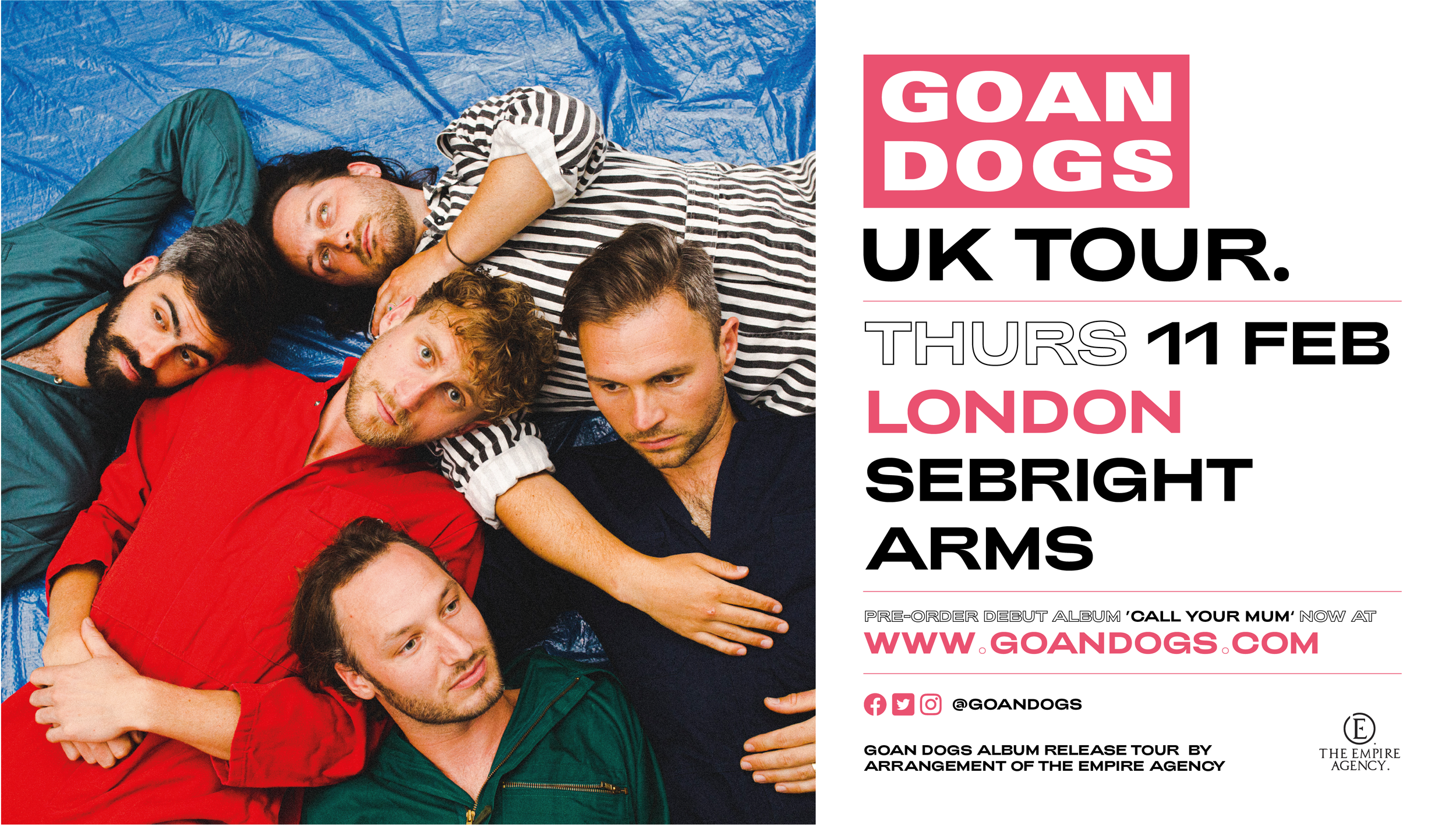
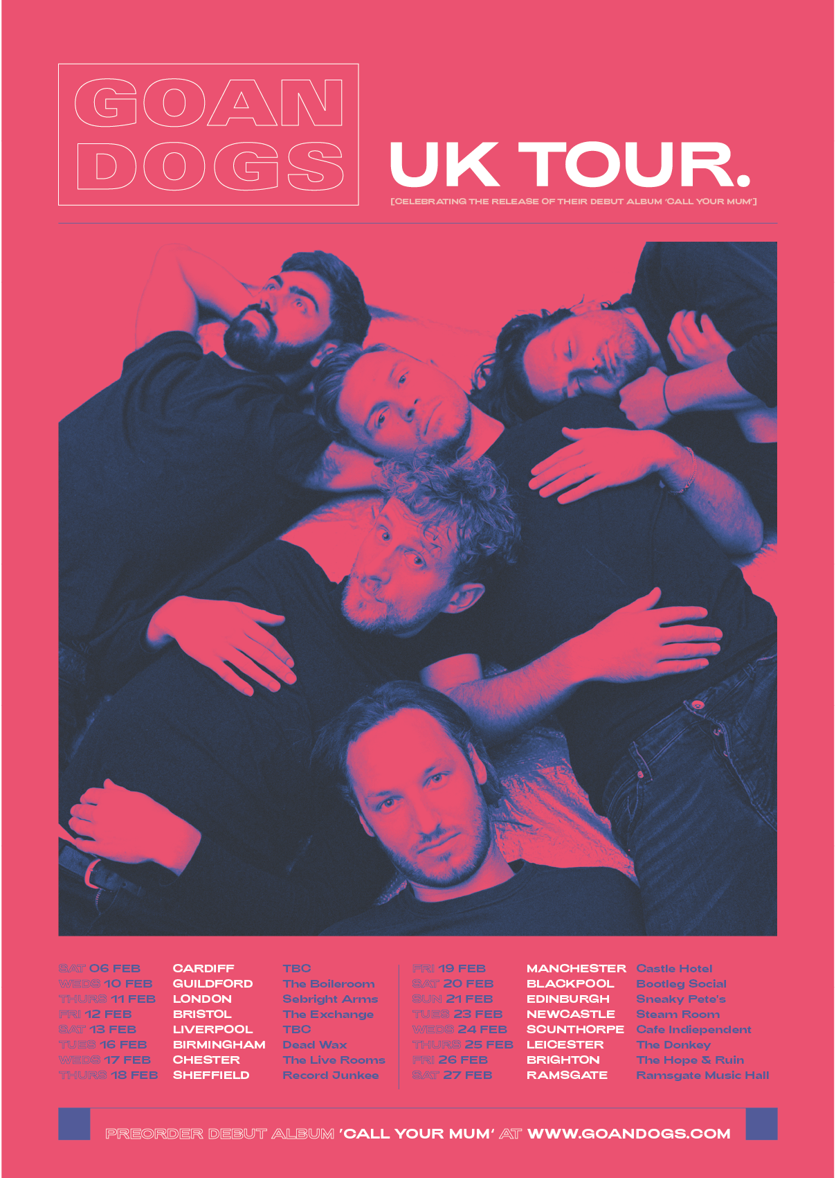
On top of taking on their albums visual identity, I also applied this system to a new set of visuals to support a UK wide tour.